I have a few books simmering on the burners. But my short story/flash collection is the one I’m closest to torturing the world with. And it needs a cover, as these things go.
Anyway, there are many choices and it’s overwhelming. I’ve narrowed it down. A lot.
I write kind of “dark” fiction but it’s not horror. It’s not thriller. It’s not really any genre. It’s just sort of…dark. Sad? No idea. But I don’t want to mislead readers with a cover that screams, “Horror!”
That was fun.
I want something that represents the darkness while also retaining some softness. If you’ve read my flash, you know what I mean. Without further ado…
Would you, could you, pretty please (with a cherry on top) take a look at these and vote for your favorite?
The font type, color, size, and placement can be changed. Any suggestions/ideas in the comments would be much appreciated.
Thank you, gentle readers. I am so very grateful.

Cover 1
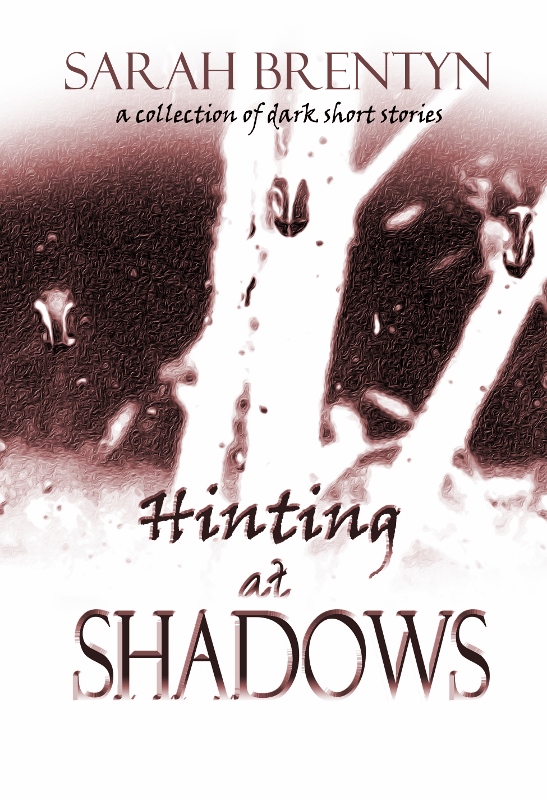
Cover 2

Cover 3

Cover 4

Cover 5

Cover 6

Cover 7
The lovely Rachael Ritchey, author of Chronicles of the Twelve Realms and founder of BlogBattle, designed these for me. I asked her for some advice after reading her post about cover design in her Indie Publishing series and, before I knew it, I had 500 designs in my inbox. I jest. There were only 400. She enjoys designing covers. And is really good at it. And is most generous with her time and talent.
All images copyright Sarah Brentyn

400 covers to choose from!! Blimey! These were very interesting to look at Sarah, some worked better than others but no. 4 ticked all the boxes for me. Good luck on the road to publication.
LikeLiked by 1 person
It wasn’t quite that many. 🙂 A slight exaggeration. Glad you liked 4. It’s a nice one…
Thank you!
LikeLiked by 1 person
Number 4, but I also like the contrast of number 6’s font colour to background. I’m not sure on the books name font tho, it doesn’t quite sit right for me, but that, as ever, is personal preference.
Love number 4. Really, love.
LikeLiked by 1 person
How did I know you’d like the purple and black? Hmm… Not sure. Yeah, the font might need to be played with. Thanks for the #4 love. Looks like quite a few people like that one. 💜 Thanks.
LikeLiked by 1 person
Cover 5 and Cover 7 are my choices…not sure about the calligraphy font, I feel like it detracts rather than adds – but it works better on the sepia cover (5).
LikeLiked by 1 person
Oh, I love the sepia. 🙂 Thanks for voting. Agreed, I think we’ll work on the font.
LikeLiked by 1 person
Wow! 400 covers to choose from. That was some culling!
I’m very excited to know that your book is getting closer to publication, Sarah. You are an amazing writer with a gift of story telling. I look forward to reading your stories all together in one book. I’ll have to pop back later to see how the votes go.
I love the font used for the title in the last four examples, and that the font is consistent within the title. I also like the placement of your name at the top and reference to the collection at the bottom. I think keeping the collection reference with the title is a good idea. You may be a collection of dark short stories, but I think it’s your book that it’s meant to describe this time. I guess I’ve given away which one I’ve voted for. That’s okay. Now you know why! (And I didn’t even vote for my favourite colour. Just my second favourite! :))
Best wishes with the decision and publication!
LikeLiked by 1 person
Not 400. Just my Brentyn Hyperbole. 🙂 And a lot more covers than I expected. Good to have choices, though. It still felt like I cut down a lot. They were all so good.
Hahaha! “You may be a collection of dark short stories, but I think it’s your book that it’s meant to describe this time.” Fair enough. I honestly hadn’t even read it that way. Too funny. I’m a walking collection of dark short stories.
Thank you so much for your support, Norah. You’re absolutely lovely. 💖 It’s exciting.
LikeLiked by 1 person
No, not hyperbole. You? Never!
I look forward to finding out which cover you choose. So exciting! Enjoy the process!
LikeLiked by 1 person
Who? *looks around* Oh, me. No. Never.
Thank you! I’m excited and we’re working on it. Trying this and that. I’ll let you know which one we choose.
LikeLike
Ooh, I think I’ve gone with the consensus on your poll 🙂 This is very exciting!
LikeLiked by 1 person
Hmm… That would be 1? Or 4 might have been in the lead when you were here. Either way, thanks for popping by and voting! 🙂 It is exciting.
LikeLiked by 1 person
I went with 4, I think. How did it all end up? (been away for the weekend with little to no wi-fi, so I am well behind!)
LikeLiked by 1 person
#1 is winning (by a lot) but quite a few people mentioned liking #4 as well or that they couldn’t decide so went with #1 for various reasons. I think the font on #4 was an issue. Working on it! 🙂
LikeLike
YAY! I love cover polls!
1 and 4 immediately drew my eye, but the font is distracting on the title. I think you’d do better by keeping the decorative font to only the word Shadows and then reducing the line space between the three lines so there is less of a gap. You could also adjust the opacity so that either hinting or Shadows is faded as way of reinforcing those words and/or you could increase the gap between the letters in the word hinting which would give it a more paranormal vibe. (If you don’t know how to do this in Word, highlight the word, right click. Select Font, click on the Advanced Tab, and then select Spacing: Expanded under Character Spacing. You can then manually adjust the space between letters.)
I’d also recommend adding one more color to give it a little more pop. Something with a bit of contrast. A yellow or tan would complement the blue-gray.
I LOVE how your name reads across, though.
LikeLiked by 1 person
Thank you so much for this feedback, Allie. We’re working on changing the font and also reducing the line space between the three words. I really think that will look nice. (Honestly, I had heard this somewhere but completely forgot you could make your cover in Word. Wow. I’m not sure I would attempt that but it is really good to know! Word is amazing.) Will try another color or two, as well, and keep the name font. I like that, too. Thanks! ❤
LikeLiked by 1 person
Can’t wait to see the final reveal!
LikeLiked by 1 person
I can’t either, honestly. What’s gonna happen??? 😉 Thanks!
LikeLike
I choose number 4 before coming here and looking at all the comments. Isn’t that interesting, that so many of us gravitated toward that one? Good luck!
LikeLiked by 1 person
It is. A lot of people love that one. Thanks for stopping by and voting! 🙂
LikeLike
I really like several of these — but I keep coming back to cover 4. Maybe try a different font or two as some have suggested. Great looking covers!
I *love* your title!
LikeLiked by 1 person
Yes, 4 seems to be a favorite. I think we will play with some different fonts.
Thank you! 💙 I’m very happy with the title.
LikeLike
4th!!! Definitely!
LikeLiked by 1 person
Thank you, my friend! 💙
LikeLiked by 1 person
#mast 💙
LikeLiked by 1 person
I liked 1, but my second choice was 4!
LikeLiked by 1 person
Excellent. Thanks, Noelle!
LikeLike
1 and 4 for me. I have to say, the title font jars with me. The chosen font for your name catches the eye and has gravitas. Very exciting! Good luck!
LikeLiked by 1 person
Yeah, those seem to be the ones most people are attracted to. Also, I agree about the font. That is definitely something we’ll play around with. Nice! “gravitas” I love it. Thanks so much! 💖
LikeLike
I went with 1 because it’s the only pic that’s really a shadow though because it lacks clarity as to what it is, not so much a hint as a confusion. So 1 is ok but actually I think you should keep thinking. I don’t go with fancy fonts but 1 works ok. And the flower image that the other commentators seem to like in 4 are a bit weird to me. Sorry to sound negative but there’s something to 1 if Rachel can work on that area. You’ll be fine because the title is stunning as are the stories… even though I’ve not seen them yet!
LikeLiked by 1 person
Hahaha! “Confusing You with Shadows” New title?
These are all my photos. Rachael was willing to work with that first one even though it didn’t quite meet the standard for whatever-it-is… Size? Pixels? Pizels? So she had to use filters on it to even get it to that point. I love it but I think we’ve worked that one to pieces. We’ll try some other things.
Not negative at all. I truly appreciate you taking the time to vote and explain your thoughts on these. You’ve only been through this…four times? And I also appreciate your lovely comment about the title (and stories – some of which you have read). 🙂 Thank you kindly, Geoff.
LikeLiked by 1 person
Pingback: Book Cover Design From RR Publishing? (that’s me!) | Fiction by Rachael Ritchey
I struggled to vote, because I think all of these are absolutely gorgeous! I went with the first one though, the colours seem to evoke that darkness without horror tone you described. Good luck!!
LikeLiked by 1 person
They are beautiful. Rachael did a nice job on these. (Which is why I’m posting here – I can’t decide.) Thank you so much for taking the time to vote and comment. 🙂
LikeLike
I like cover 7 best.
LikeLiked by 1 person
That one has such a beautiful softness. It’s one of my favorites. The streaks through it imply maybe all is not “rosy”. 😉 Thanks for voting!
LikeLiked by 1 person
It was between 1 and 4 for me! Love the depth of colour – ended up choosing number 1 after much scrolling up and down your page 🙂
LikeLiked by 1 person
Thanks so much, Shelley. A lot of people like those two. I so appreciate your vote but also your comment letting me know that. 🙂
LikeLiked by 1 person
I’m another one for #4. Love, LOVE the use of flowers. To me, the colours suggest danger and deception, but the flowers hint at life and hope.
I couldn’t choose a runner-up because all the other covers are equally terrific. But you have to use #4. Because I said so. 😉
LikeLiked by 1 person
And how exciting is this!! When will the book be available for purchase, and how can I arrange a signed copy (if you’re going the paper route)?
LikeLiked by 1 person
Thanks! It’s due out this fall. So…soon. Eek. And I am going the paper route (without a bike and “I want my two dollars!”) and you are so sweet! ❤ Email me.
LikeLiked by 1 person
Hahaha! Because you said so. Then it’s decided. 😉
You know, much as I love the flower ones, I hadn’t thought of this: “the colours suggest danger and deception, but the flowers hint at life and hope.” Leave it to you to find the symbolism in this. You’re the bee’s knees. Thanks for voting and commenting and being generally awesome.
LikeLiked by 1 person
Popping in a bit late here, but I think you already know my feedback. 🙂 I like #4 on the blog. I’m looking forward to seeing which one you end up going with and all the other variations you might have!
LikeLiked by 1 person
Yes, another for 4. 🙂 We’re working on that one for readability but it’s a favorite of quite a few people. Thanks!
LikeLike
I was torn between 1 and 4 and noticed that those two were the most popular. I chose 4. I think the vibrancy in background colour enhances the mood of the book. Lovely covers. Oh, and I do like the font too. 🙂
LikeLiked by 1 person
Yes, those seem to be popular! Thanks so much for voting and commenting. This is helpful: “the vibrancy in background colour enhances the mood”. We’re working on something with elements from these two favorites. 💖 Much appreciated.
LikeLiked by 1 person
Happy to contribute. 🙂
LikeLiked by 1 person
Oooh poll closed so I’ll give you my vote here. I really liked #4. The first one is interesting, but also confusing in a way. The reader doesn’t know what it is, so when quickly browsing there’s not a recognizable image to catch and hold the eye. Does that make sense? The color in #4 grabbed me and then the flowers drew the eye and then the shadowy stripes raise the question “That’s interesting…what is this about?” I think the juxtaposition of the shadowy flowers and stripes give the “dark but not horror” feel that you described. I’m not an expert, but there are both of my two cents 🙂
LikeLiked by 1 person
I agree about #1. I love it but what you’ve said completely makes sense. I’m so glad that #4 gives you the “dark but not horror” feel. And that the flowers and shadowy stripes (which are actually trees!) work well here. ❤ Quite a few people sent me emails and liked #4 as well so you are not alone in choosing a cover but not voting. I truly appreciate your feedback and that you took the time to comment even though the poll was closed. Your covers are gorgeous and I am thrilled to hear your thoughts on these. Thank you! 🙂
LikeLiked by 1 person
I realized after commenting that it was an older post but hope it was helpful anyway. Did you go with one of these or are you still working on it?
LikeLiked by 1 person
I actually am still working on it so was very happy to see your comment. 🙂 We’re nearly there…
LikeLike